ShopDreamUp AI ArtDreamUp

Deviation Actions


Suggested Deviants


Suggested Collections


You Might Like…


Featured in Groups


Description
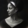
Finally, a portrait with colored pencil.  (Smile)") This is a good practice for skin tone, one of the most challenging aspect of figure/portrait painting. There is no one right color for a skin ton since a skin tone (like most other things in real life) change in relation with its environment.
This is a good practice for skin tone, one of the most challenging aspect of figure/portrait painting. There is no one right color for a skin ton since a skin tone (like most other things in real life) change in relation with its environment.
For this portrait, I didn't have a developed formula for colors. I only observe closely on my reference and picked the closest color based on my first impression. If things didn't look right, then I re-adjust as I go. This is very important aspect of art creation. We should really free our mind from "mistakes" and just go with our gut feelings. Your final product will reflect your accumulated effort and thoughts.
I enjoyed the process as well as the result. This is nowhere close to perfect. There is a point of diminishing return, and I said enough is enough.
About the title, the reference title was "Veiled," and my initial idea was "Unveiled." As the drawing progress, I added the dramatic lighting in the design. So, here it is, "(the) Nightfall." I hope you like it. If you do, please leave me a comment because I would love to hear your feedback. Thanks and have a good day!
Medium: Prismacolor Colored Pencils (95% Premier + 5% Verithin)
Support: 11x14 Stonehenge Paper (cropped to 10.75x13.75)
Other: OMS and brush
Duration: 02/27/2013 ~ 03/23/2013
Reference: [link]
Facebook Me: [link]
WIP: Previous:
  Next:
Next: 
For this portrait, I didn't have a developed formula for colors. I only observe closely on my reference and picked the closest color based on my first impression. If things didn't look right, then I re-adjust as I go. This is very important aspect of art creation. We should really free our mind from "mistakes" and just go with our gut feelings. Your final product will reflect your accumulated effort and thoughts.
I enjoyed the process as well as the result. This is nowhere close to perfect. There is a point of diminishing return, and I said enough is enough.
About the title, the reference title was "Veiled," and my initial idea was "Unveiled." As the drawing progress, I added the dramatic lighting in the design. So, here it is, "(the) Nightfall." I hope you like it. If you do, please leave me a comment because I would love to hear your feedback. Thanks and have a good day!
Medium: Prismacolor Colored Pencils (95% Premier + 5% Verithin)
Support: 11x14 Stonehenge Paper (cropped to 10.75x13.75)
Other: OMS and brush
Duration: 02/27/2013 ~ 03/23/2013
Reference: [link]
Facebook Me: [link]
WIP:
Previous: Next: Image size
645x825px 215.45 KB
Comments45
Join the community to add your comment. Already a deviant? Log In
Very beautiful and aesthetically pleasing. One thing I'd suggest is you could've made the hood more tapered at the lower edges, like she's holding it around her. I think it would appear more natural that way. I marked almost 5 stars but not quite on originality, because there are so many like this already, but that certainly doesn't take away from the breathtakingness of it. I like the soft use of purples. That makes it very pretty. Another thing that doesn't make it seem quite natural is her overbite, it doesn't really match the shape of the chin. I really like this a lot though, and it's definitely complete. 5 stars - vision, 4 1/2 stars originality, 4 1/12 stars technique, 5 stars impact. Well done!